Simian Risk Group is celebrating 10 years in business this year and to signify this we are giving them a bit of re-brand.
Simian is well known and respected within the scaffolding industry and part of their iconic image is the three monkeys which forms part of their logo. Just to give you a brief history… the company was established in 2005 by Simon and Ian. You got it, that’s where Simian comes from. As well as being the name of a leading provider of scaffolding consultancy and training worldwide, Simian also means ‘monkeys’.

So naturally the monkeys had to stay, but everything else was considered and updated. As part of the rebrand we have moved away from the restricted box that was used on the original set of logos. We have also introduced a new colour (orange) for the International arm of the business.
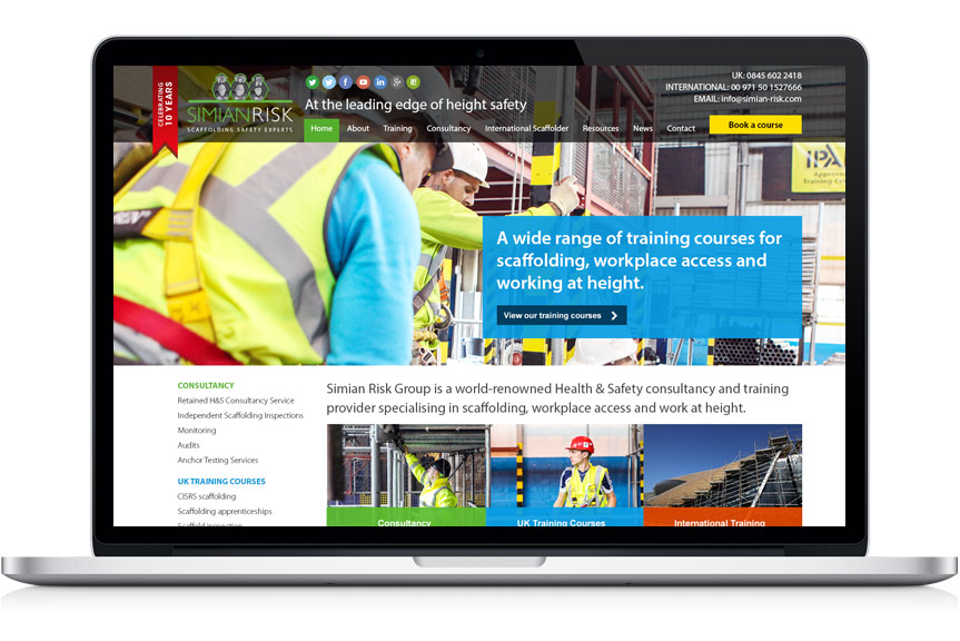
To signify the 10 year celebration we have designed a banner to be used across all of their marketing and the website.
Here is a sneak peek of how the new responsive website is coming along with the new brand:
Congratulations Simian on making it to 10 years at the top, here’s to the next 10!